Visualizing Interrater Reliability
By James Malloy
March 5, 2022
In the realm of research, the term reliability refers to how consistently a method measures something. If the same result can be consistently achieved by using the same methods under the same circumstances, the measurement is considered reliable.
I’m currently working on a research study where participants have to construct written responses. Those written responses are then evaluated by my co-researcher and me and given a quality score between 0 and 3. Thus, our task is to ensure our results are reliable (i.e. that we are more on the same page with scores than not.)
# tib <- tibble(
#   mutate(partici)
#   participant_id = mutate(cur_group_id()
# )
Round 1
Percent Agreement
Perhaps the simplest way to think about reliability is percent agreement. As its name suggests, percent agreement is simply the percentage of times my co-researcher and I gave someone the exact same score.
time permitting add example table here
tibble(
  c(~participant_id, ~participant_response, ~rater_1_score, ~rater_2_score)
)
## # A tibble: 4 x 1
##   `c(~participant_id, ~participant_response, ~rater_1_score, ~rater_2_score)`
##   <list>
## 1 <formula>
## 2 <formula>
## 3 <formula>
## 4 <formula>
Unfortunately, high percent agreement can also be difficult to reach because what one rater might score a 0, the other might score a 1, what one rater gives a 1, the other might rate a 2, and so on and so on.
This proved to be true for my co-researcher and I as well. I calculate below our percent agreement for our 1st training session.
set.seed(1234)

df_irr %>%
  filter(training==1) %>%
  summarize(mean(agree_round_1, na.rm =T)) # calculate percent agreement
## # A tibble: 1 x 1
##   `mean(agree_round_1, na.rm = T)`
##                              <dbl>
## 1                            0.489
df_irr %>%
  filter(training == 1) %>%
  select(coresearcher_round_1,james_round_1) %>%
  pivot_longer(cols = c(coresearcher_round_1,james_round_1),
               names_to = "researcher",
               values_to = "score") %>%
  ggplot(aes(researcher, score, color = researcher)) +
  geom_jitter(width = .1) +
  geom_smooth(method = "gam") +
  scale_x_discrete(labels = c("Coresearcher", "James")) +
  theme(legend.position = "none")
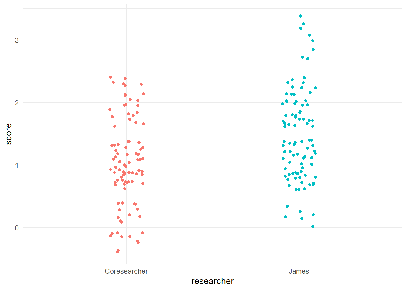
40%…YIKES! NOT GOOD! With percent agreement, you want to be in the 70-80% range, certainly no lower than 60%. What was the source of our disagreement? I explained part of it earlier that percent agreement means “perfect agreement.” In other words, you get no slack even if your scores are close to one another. In essence, percent agreement could then be aptly changed to “perfect agreement.”
Cohen’s Kappa
To consider the reality of the distribution of possible scores between scorers, researchers enlist another statistical tool call Cohen’s kappa.
Cohen’s kappa measures the agreement between two raters who each classify N items into C mutually exclusive categories.¹ A simple way to think this is that Cohen’s Kappa is a quantitative measure of reliability for two raters that are rating the same thing, corrected for how often that the raters may agree by chance.
https://towardsdatascience.com/cohens-kappa-9786ceceab58
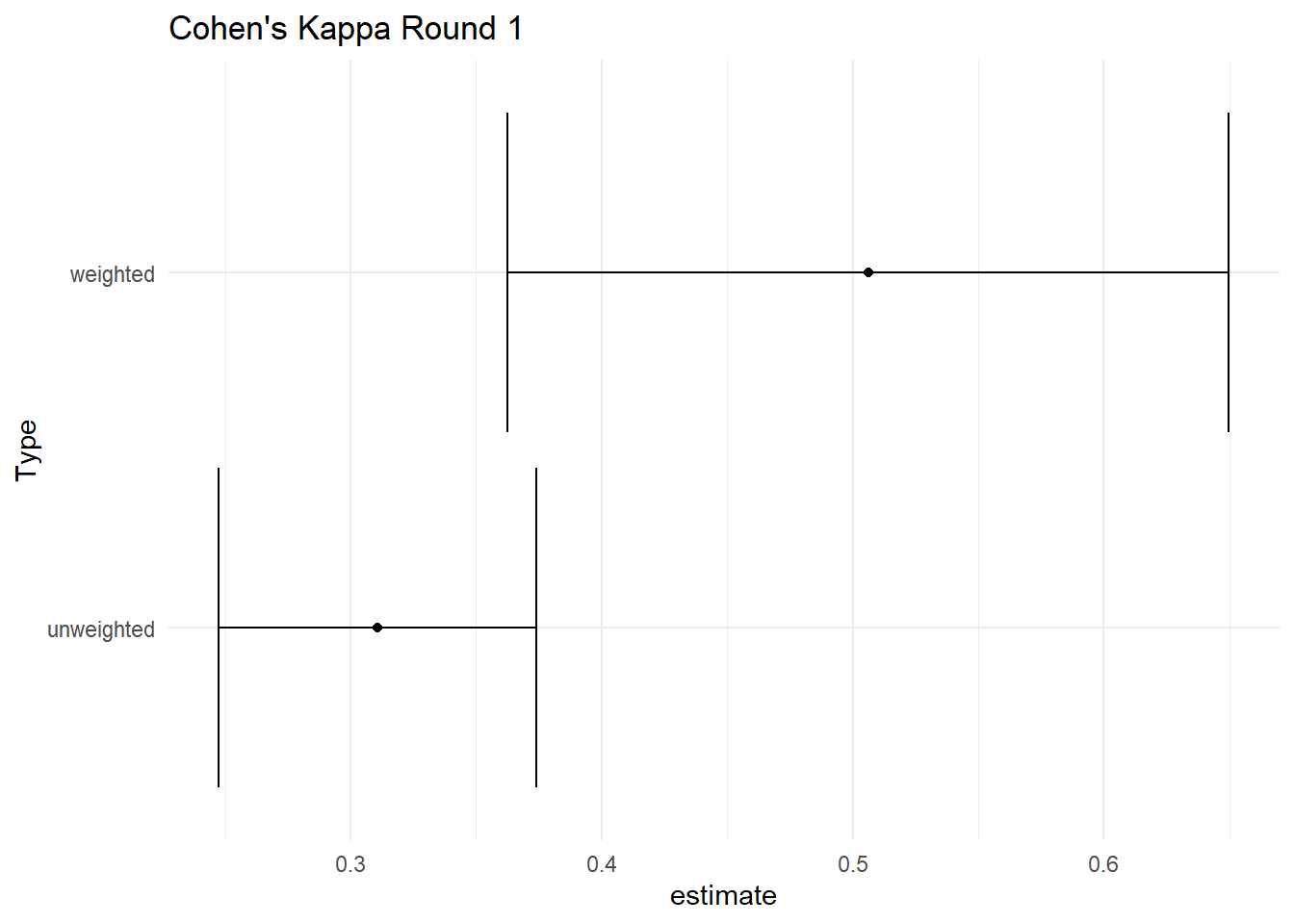
I calculate cohen’s kappa for the same set of scores. Unfortunately, Cohen’s kappa doesn’t prove to be any better than the percent agreement and only leaves more questions.
| type | estimate | conf.low | conf.high |
|---|---|---|---|
| unweighted | 0.31 | 0.25 | 0.37 |
| weighted | 0.51 | 0.36 | 0.65 |
ggplot(tidy(ck_round_1), aes(estimate, type)) +
  geom_point() +
  geom_errorbarh(aes(xmin = conf.low, xmax = conf.high)) +
  labs(y = "Type", title = "Cohen's Kappa Round 1")
# to use the irr:cohen.kappa function, you must feed it a matrix with *just* the two scorers

df_round_1 <- # assign object to "df_round_1"
  df_irr %>%  # call original data frame
  select(coresearcher_round_1, james_round_1) %>% # select just the scores
  data.frame() # to use the cohen.kappa function you MUST feed it a data frame object

ck <- cohen.kappa(df_round_1)

ck %>%
  tidy() %>%
  kable(caption = "Cohen's Kappa Round 1", digits = 2)
Confusion Matrix
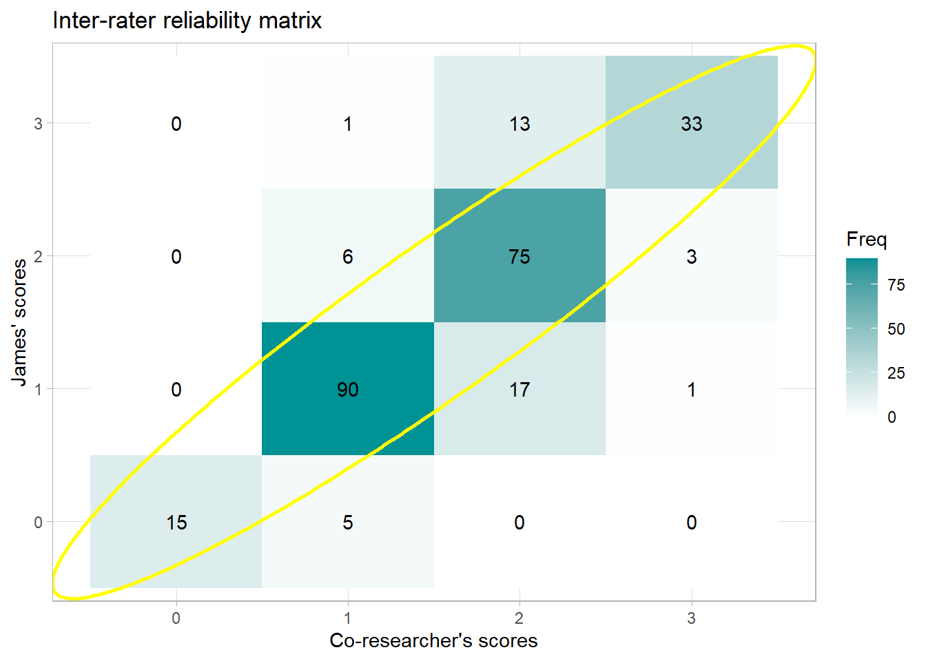
To get to the bottom of inter-rater disagreements, it’s helpful to visualize them with a confusion matrix like the one below. The numbers that fall along the red arrow indicate the times when my co-researcher and I had perfect agreement. In a perfect world (i.e. in world where raters agree 100% of the time), this arrow would be the only place you’d see numbers.
However, each time we disagreed falls off this arrow. This visualization revealed two problematic areas for us:
-
When I rate participants a 0 and my co-researcher rates them a 1
-
When I rate participants a 1 and my co-researcher rates them a 2
In other words, I’m a tough grader 😅. To be fair though, this project that I’m on isn’t something I had previous experience in. I asked to join to try something new.
Any number that does not fall on this red line indicates the times where we did not agree. Lastly, the numbers indicate frequency such that higher numbers are depicted by darker colors.
Any
In a perfect world, raters would be
df_irr %>%
  select(coresearcher_round_1, james_round_1) %>%
  table() %>%
  as.data.frame() %>%
  ggplot(aes(coresearcher_round_1, james_round_1, fill = Freq)) +
  geom_tile() +
  geom_text(aes(label = Freq)) +
  geom_ellipse(aes(x0 = 2.5, y0 = 2.5, a = 3, b = .35, angle = .75),
               color = "yellow", size = 1,
               inherit.aes = F) +
  geom_ellipse(aes(x0 = 2, y0 = 1, a = .5, b = .25, angle = 0),
               color = "red", size = .5,
               inherit.aes = F) +
  geom_ellipse(aes(x0 = 3, y0 = 2, a = .5, b = .25, angle = 0),
               color = "red", size = .5,
               inherit.aes = F) +
  scale_fill_gradient(low="white", high="#009194") +
  theme_light() +
  labs(x = "My Co-researcher",
       y = "James (Me)",
       title = "Inter-rater reliability matrix",
       caption = "Problem areas circled in red")
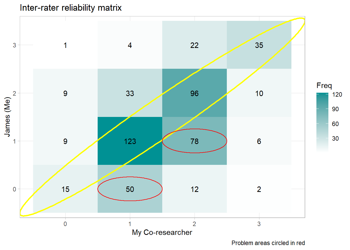
The confusion matrix reveals two problem areas:
-
when I (Rater 2) am scoring responses as 0 that my co-researcher is scoring as 1 and
-
when I (Rater 2) am scoring things as a 1 that my co-researcher is scoring as a 2.
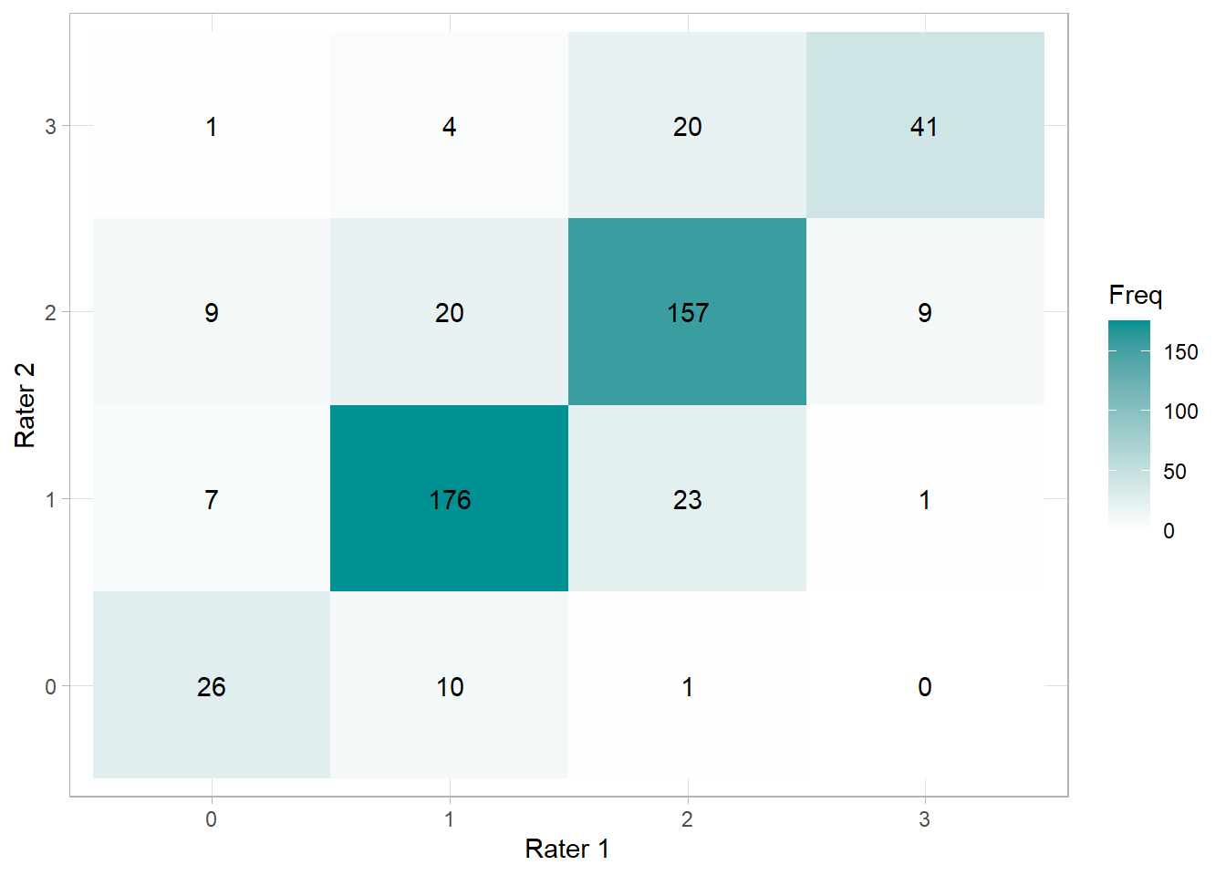
By the looks of it, I’m a tough grader. To be fair, this study I’m working on is not my primary domain. I asked to be part of it to have some research experience under my belt. After pinpointing our problem areas, my co-researcher and I confer to discuss our different points of view. Eventually, we’re able to get our percent agreement and reliability to what you see below.
Round 2
# Create matrix
df_round_2 <-
  df_irr %>%
  select(coresearcher_round_2, james_round_2) %>%
  data.frame()

irr::agree(df_round_2) # an alternative way to calculate % agreement
##  Percentage agreement (Tolerance=0)
##
##  Subjects = 505
##    Raters = 2
##   %-agree = 79.2
cm_round_2 <- table(df_round_2) %>% as.data.frame()
# cm_round_2

ggplot(cm_round_2, aes(coresearcher_round_2, james_round_2, fill = Freq)) +
  geom_tile() +
  geom_text(aes(label = Freq)) +
  scale_fill_gradient(low="white", high="#009194") +
  theme_light() +
  labs(x = "Rater 1", y = "Rater 2")
cohen.kappa(df_round_2) %>%
  broom::tidy() %>%
  kable(caption = "Cohen's Kappa Round 2", digits = 2)
| type | estimate | conf.low | conf.high |
|---|---|---|---|
| unweighted | 0.68 | 0.63 | 0.74 |
| weighted | 0.76 | 0.76 | 0.76 |
df_summary_by_question <- df_irr %>%
  group_by(response, training) %>%
  summarize(
    n = n(),
    agreement_round_1 = sum(agree_round_1 == 1)/n,
    agreement_round_2 = sum(agree_round_2 == 1)/n
    )

ggplot(df_summary_by_question, aes(x = response, y = agreement_round_1, color = as.factor(training))) +
  geom_point() +
  #scale_color_gradient(low="white", high="#009194") +
  ylim(c(0,1)) +
  labs(y = "Percent Agreement",
       x = "Question") +
  theme(axis.text.x = element_text(angle = 90, vjust = .5, hjust=1))
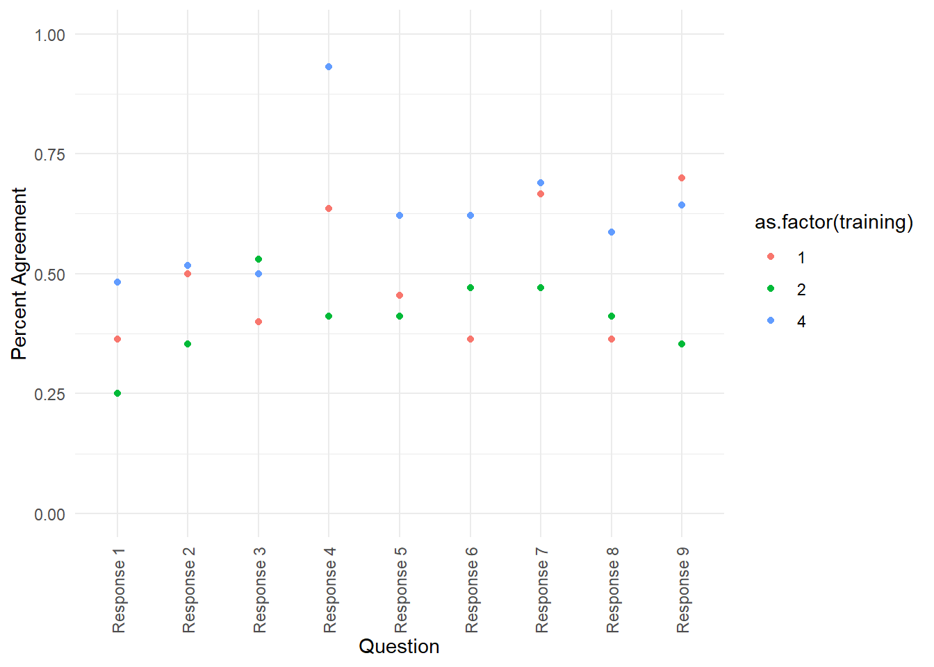
Long story short, we’re eventually able to get our reliability to what you see below.
df_irr %>%
  filter(training == 4) %>%
  select(coresearcher_round_2, james_round_2) %>%
  table() %>%
  as.data.frame() %>%
  ggplot(aes(coresearcher_round_2, james_round_2, fill = Freq)) +
  geom_tile() +
  geom_text(aes(label = Freq)) +
  geom_ellipse(aes(x0 = 2.5, y0 = 2.5, a = 3, b = .5, angle = .75),
               color = "yellow", size = 1,
               inherit.aes = F) +
  scale_fill_gradient(low="white", high="#009194") +
  theme_light() +
  labs(x = "Co-researcher's scores",
       y = "James' scores",
       title = "Inter-rater reliability matrix")
- Posted on:
- March 5, 2022
- Length:
- 6 minute read, 1261 words
- See Also: